Sunday, February 7, 2016

Project W.F. Proposal

PROJECT W.F.

This spooky animated blockbuster will have you on the edge of your seat!


Animated Horror / Drama set in the 90's


Project W.F.
Preview Animatic


Preview Animatic V.2


Wednesday, February 3, 2016

Project WF Animatic! ...Sort of.

WELL... I had some ISSUES.
Every time I tried to record for my voiceovers, my program would crash.
(And, of course, I was waiting to get done with the audio before I did more visuals.)

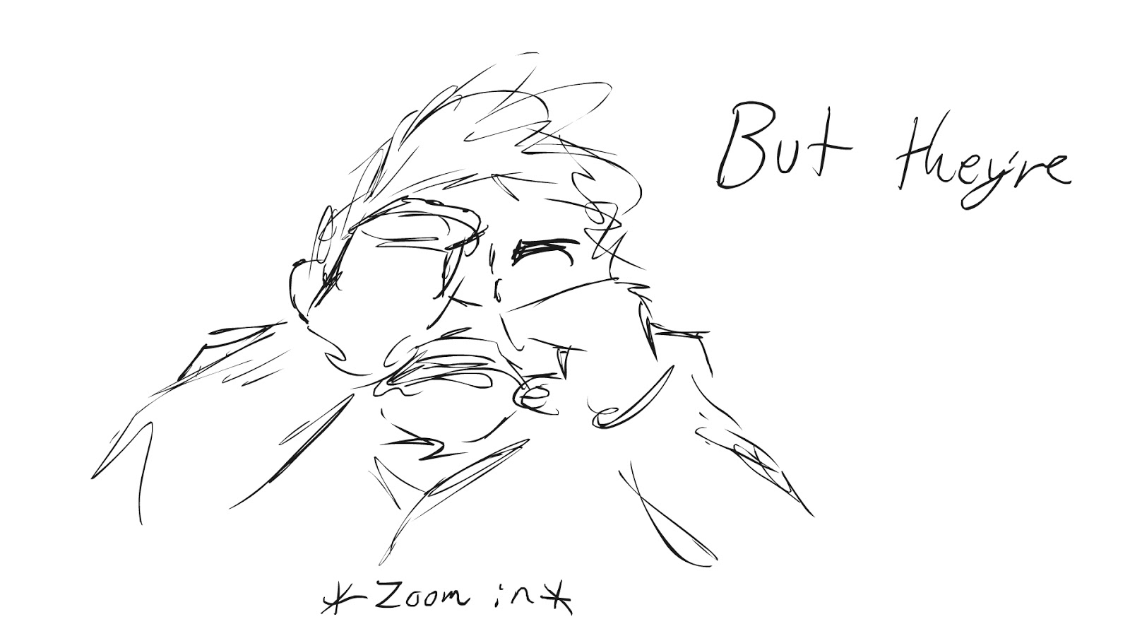
Despite this, here's my storyboard in single image form...!


Monday, February 1, 2016

Project WF

SUPER-SECRET PROJECT WF:
(It stands for were-fish)

Basically, this short will be like a scary movie trailer.  It builds up tension with a voice over, followed by very moody visuals.  It follows Cheryl, a concerned girlfriend who is searching for her boyfriend, who ran off unexpectedly.  She finally happens upon him when he is transforming, and he is very apprehensive about her being there.  He finally transforms to reveal that he's...  A WERE-FISH!  He runs off in shame, and that ends the short.

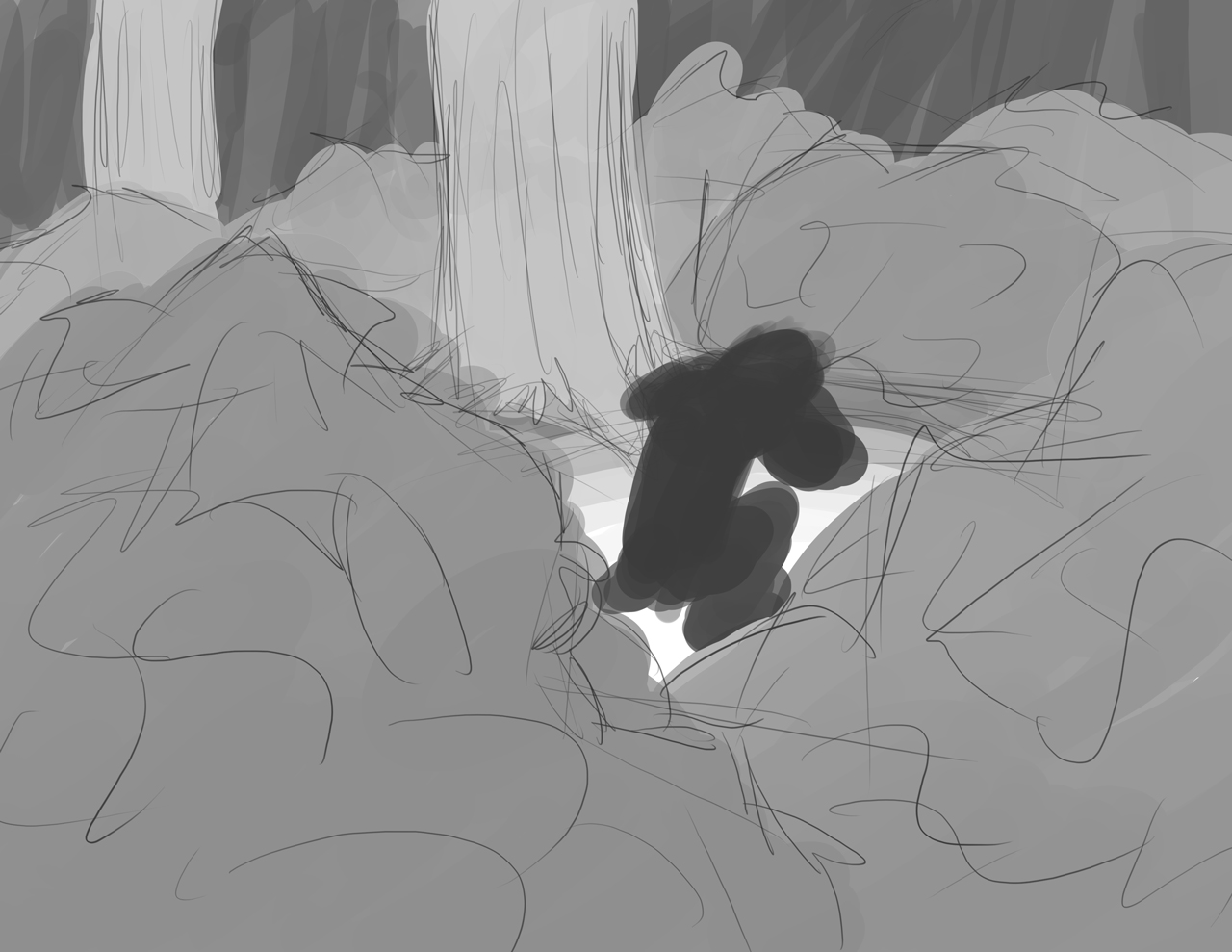
To break it up visually, it begins with moody scenery shots.  It then starts to follow Cheryl, moving through the scenery, flashlight in hand.  She finally happens upon Frank, who is in the shadows and partially obstructed by the foliage.  His transformation is slow up until this point, but once Cheryl finds him, his transformation is instantaneous.  (Perhaps a "POP!" sound effect to emphasize the speed.)  He returns to view as a fish with legs and heart-boxers!  He then awkwardly stumbles off yelling "Don't look at me" and flailing his flippers.


Tuesday, January 26, 2016

New Short Animation!

"Out With the Old!"


The Process:


Do keep in mind that this was intended to be used as a 100x100px icon, as well as be under 55kb at said size!  
(And you know what?  It -ACTUALLY- worked!)


Sunday, January 24, 2016

Character Sketches, Scenery Thumbnails, and Analyzed Pieces!

- Character Sketches -


Scenery Sketches


Reference Images


Analyzed Pieces:

(Concept Art from Disney's Zootopia)

This piece seems to follow the same contrasting "light and dark" sequence that we discussed in class.  It creates a sense of depth with repeating the same thing several times at various points in the piece.  (IE, the rabbits are EVERYWHERE!)  That being said, it also gives a stark size contrast between the characters.  It could also be argued that the protagonist's face falls within the rule of thirds, albeit rather loosely.

(Concept Art from Disney's Zootopia)

This piece definitely showcases the token "thing in foreground" to again give a sense of depth.  That being said, however, this seems to be a rather flat piece when it comes to the cityscape.  There is some "stair-stepping" of contrasting colors, but much less noticeably so.  Overall, I believe this piece may have been intended less as an actual scene and more of a general concept / look.

(Concept Art from Disney's Zootopia)

This is an interesting piece, as it shows some of the dynamic relationships between the inhabitants of this world.  Also, it showcases how the sizes of things greatly very, almost certainly implying some future sight gag related to size.  The general lack of concern for potentially life-threatening situations is also something to note.  Notice also the use of repetition to show depth and scale in the piece.  (Not to mention once again the contrasting colors and minor stair-stepping that is occurring.)

Tuesday, January 12, 2016

Animation + Storyboard!

I've created MASTERPIECES


SO I only did 36 frames for this...  It works though!

-----


And here is my beautiful storyboard!

Monday, January 11, 2016

Silhouette Practice!

Here's My Character Silhouettes!

Most of these are drawn traditionally using a brush pen.
Originally, I was working digitally, as shown by the other silhouettes.


My References That I Totally Didn't Find After-The-Fact!


OKAY, so I may have found these later.  I had these in mind when I did these though!

-----

My silhouettes were obviously drawn from what I know and what I am comfortable drawing.  (Notice the many cat-inspired drawings!)  That being said, I did go out of my comfort zone with some of the more wiggly characters.  Also, many of them don't REALLY make sense, which somewhat bugs me, but they definitely have unique posing and personality!